Fashion Design

Fashion Design Workshop 2014

Not long ago, we had a fashion workshop in school given by the co-founder of Love Bonito. We were introduced to the current trend in fashion and of course, tips to becoming fashionable, or rather, part of the trend. We were told that things like colour of the skin and the colour of the clothes that we wear have a close relationship and is inseparable. Each of us would have a range of colours that we look best in and of course, a range that we should avoid wearing. We learnt about the fundamentals of fashion, and we were told to look out for what materials to choose depending on the design and the practicality of the piece. We were given some time to come up with some designs and to just draw whatever that comes to mind.

photo 3

 Design 1

photo 4

Design 2

These two designs were what I came up with initially. The first design speaks with a more futuristic tones, with the use of geometrical shapes, I thought that it would make the design look more refined, and by choosing white for the piece, I wanted to achieve a sense of a pure and clean being. Hence, the colour and design is specially targeted at younger women, ranging from 18-25. The second design is a more mature one. By making the sleeves chiffon, I wanted to bring in a sense of freshness while keeping the look classic. A lot of women go after black as it has a slimming effect; hence, I wanted to make use of that effect and enhance it by adding it at the waist area and the area below the thighs. The belt is a detail that adds to the vibrancy of the piece.

Personally, when i think of street wear, it would be along the lines of brands like Hood By Air (HBA), Mastermind, Pyrex and Undefeated etc. These are the brands that I often wear and are more towards the hardcore hip hop street wear; hence, I thought: Hey! Since girls are wearing it, it can’t be look too guy-ish or too tough right? Hence, I thought that I should probably combine elements of urban wear and street wear and go softly on the combination so that they will fuse together and not clash. So below are my sketches and final designs.fs 2 Sketch

photo 1

Design 3

photo 2

Design 4

Firstly, for Design 3,  I wanted it to be a slightly ‘bad girl’ style, so more elements of the hip hop street style were put in. The top is washed with grey and has far less details as compared to the bottom so that the overall look would not be too much or too heavy. For the top, triangular shaped cut-outs ware made in the shoulder region to give a modern feel (elements of urban) and as for the ends of the top, it is cut in the shape of an inverted skyline and also makes the top look more hipster. I would make the top out of cotton as I truly feel that comfortable clothes make a women most confident. For the bottom, I’ve created a ‘one-piece’ including the out layer and the inner layer. The outer layer is inspired from the boyfriend t-shirts that girls like to wrap around their waist and, which is also commonly seen in the street wear scene. However, I decided that plaid shirts are too boring, hence, I added irregular details or patterns to the outerwear which is made of thin cloth, making it the focus of the overall outfit. The inner wear, on the other hand, is to complement the top, with similar themes of modernization and made of faux leather. Other than the outerwear, the rest of the outfits are designed simply, including the plain black boots so that the attention can be placed on the outerwear. I feel that this piece is quite satisfying for me as it is firstly, comfortable, and secondly, a mixture of urban and street, hence, more suitable for a younger age range and even for hip hop/street jazz dancers!

Design 4 showcases a more quiet street style in comparison to Design 3 which has brighter colours. The overall focus/point of the outfit is the strips design that appears in the snapback, tights and shoes. This design is more punky and hence, a snapback is a good way to enhance this. The white blouse is worn under the plain grey pullover with the collar being seen. A yellow detail is added to the collar to match the studs in the shoes and to lift up the dull colours. The blouse is made of chiffon material for comfort and the pullover is also made of thin cloth so that it would not be too hot. The tights are made of faux leather so that it will look glossy and more high-class as compared to regular tights. The shoes are designed to be more exaggerated to balance out the simple designs of the top and bottom; hence, the studs and zip give an overall punky  look and the platforms add to the hip-hop look. The shoes also contain the details, which are the stripes, that are found throughout the outfit.

In conclusion, this workshop was fun and being able to experience how it is like to be a fashion designer was even more amazing. Hopefully, there will more chances in the future for designing projects!

Sculptural Ensemble of Constantin Brancusi at Targu Jiu

Constantin Brancusi

Constantin Brâncuși was a Romanian-born sculptor who made his career in France . As a child he displayed an aptitude for carving wooden farm tools and making using of materials that were usually from the Earth itself. His art emphasizes clean geometrical lines that balance forms inherent in his materials with the symbolic allusions of representational art. Famous Brâncuși works include the Sleeping Muse (1908), The Kiss(1908), Prometheus (1911), Mademoiselle Pogany (1913),The Newborn (1915) and The Endless Column (1938). Considered a pioneer of modernism, Brâncuși is called the patriarch of modern sculpture.

The Kiss(1908)

The Sculptural Ensemble of Constantin Brancusi at Targu Jiu

The Sculptural Ensemble of Constantin Brâncuși at Târgu Jiu is an homage to the Romanian heroes of the First World War. The ensemble comprises three sculptures: the Table of Silence, the Gate of the Kiss and the Column of the Infinite, on an axis 1,300 m (4,250 ft) long, oriented west to east. The Ensemble is considered to be one of the great works of 20th century outdoor sculpture. The monument was commissioned by the National League of Gorj Women to honor those soldiers who had defended Targu Jiu in 1916 from the forces of the Central Powers. Constantin Brancusi was at the time living in Paris, but welcomed the opportunity to create a large commemorative sculpture in his homeland. He accepted the commission in 1935, but refused to receive payment for it.

Names of the sculptures:

  • The Column of the infinite 
  • The Apostles’ Table
  • The Monument of the Unity of the Nation

The Column of the infinite ( The Endless Column )

File:4346487 orig 1.jpg

The Endless Column symbolizes the “Infinite Sacrifice” of the Romanian soldiers and it is considered by Sydnei Geist the top point of the modern Art. The Endless Column stacks 17 rhomboidal modules, with a half-unit at the top. The incomplete top unit is thought to be the element that expresses the concept of the infinite.  Brâncuși had experimented with this form as early as 1918, with an oak version. All 17 rhomboidal modules accumulate a total height of 29.3 m. The number of component modules represents the year on which Romania came into the First World War and the ending half module represents the half part of the respective year.

In the 1950s, the Romanian communist government planned to demolish the column, but this plan was never executed. After the Romanian Revolution of 1989 and the fall of the Communist regime, there was renewed interest in restoring the column, which by that time suffered from tilting, cracking, metal corrosion, and an unstable foundation. For these reasons the site was listed in the 1996 World Monuments Watch by the World Monuments Fund. The restoration was facilitated by the Fund, which organized meetings for the stakeholders in 1998 and provided funding through American Express. Subsequently, the site was restored between 1998 and 2000 through a collaborative effort of the Romanian Government, the World Monuments Fund, the World Bank, and other Romanian and international groups.

The Apostles’ Table

Constantin Brancusi - The Silence Table / Masa Tacerii - Targu Jiu - Romania

The Apostles’ Table is made in limestone with dimensions: panel diameter 2, 15 meters, thick 0,43 m and the leg is 2 m in diameter and 0,45 m thick. It represents the table around which gather the soldiers before confronting their enemy. The Table is comprised of one large cut stone circle set atop another only somewhat smaller.  Around the table, the artist placed twelve stools, each at a remove from the table and from one another.  The table is larger than any one would find in a Romanian home.

At the same time, the twelve stools stand in silence for the time disposed in hourglasses. Some make an analogy with The Last Supper of Leonardo da Vinci the monument being composed of 12 seats (representing the apostles) and in the middle Jesus Christ place.  Next comes the Chairs (stools) Alley, representing those who participate without any implication, waiting for the end.
This is not a circle begetting intimacy.

In this sculpture, Brancusi brings a profound understanding of human grief to his work.  Losing someone violently is hard.  Losing the young without warning is harder still.  The mourner yearns, aches, even bargains:  “If there could be just one more word, one more touch, one more moment with the beloved…, give me that.  Then I could accept this death.”  We hunger for one word.  There is nothing.  Only silence.  Silence is the dark truth of death.

Thirty stone seats were designed by Brancusi to flank the walkway from the Table to the gate.  The artist had benches built from some leftover slabs of stone. These were placed on either side the stone gate.

The Table, walkway seating, and gateway all combine to provide the little riverside park with all the appurtenances of a sociable Romanian graveyard.  This kind of architecture is familiar today as it was in Brancusi’s youth.

The Monument of the Unity of the Nation (The Gate of the Kiss)

File:Brancusi Gate Of Kiss Tragu Jiu 2013.JPG

The Gate of the Kiss is the second element of the ensemble. Technically, it looks like a triumphal arch having 5,13m high;  on each side of the arch the pillars (1,69 m width)  have carved the symbol of kiss:two halves of a circle, so characteristic of Brancusi’s work, on every side– the motif of the eyes looking inside. The 5,45m long architrave has also carved this symbol, like a watermark.

Romanians erect gates at the entries to homes, to churches, graveyards.  On these gates are incised protective devices as each gateway marks a passage from an impure place to a better place. Brancusi’s design for the Gate of the Kiss is marked by an iconic image he returned to many times in his work:  the kiss.

The Gate of the Kiss is a simple post-and-lintel stone arrangement cut from locally quarried honey-colored travertine. On the lintel forty paired kissing figures are incised. This lintel stylistically relates to the Montparnasse sculpture Brancusi had placed years earlier, at the request of friends, on a young, unmarried woman’s grave in Paris. The eyes go first, not to the lintel, but to the gateway’s two supporting posts which are emblazoned on all four sides with a bifurcated circular relief. It suggests a dividing cell, an ovarian egg, even the eyes of the soul as Brancusi had mentioned himself. It can also have other readings, among them, the tree of life.

In Romania, the tree of life is visualized as a fir tree.  The tree is sometimes depicted as a bisected circle with a branching bar, its roots triangulated into the earth, the branches spreading to the heavens, pulling the sun down to the earth mother.  The device Brancusi cut into each side of the squared posts of the Gate of the Kiss similarly pulls the gaze downward to the earth below.  In the Gate of the Kiss, we have the perfect synthesis of the sculptor’s life-long focus on love, presented in a wistful, yet erotic, post-and-lintel presentation.

The significance of The Gate of the Kiss is making the transition to another life,  symbolizing the triumph of life over death. The second meaning of the  gate is that the kiss means union of the eight columns or regions that was attached to the mother country, Romania.

Personally, I feel that that these three sculptures are very simple, but efficient in conveying the message that the artist wants to bring across. The fact that these three works are linked by a common theme which I believe is life and death, shows the correlation among the three sculptures and it is definitely a successful ensemble the more I look at it. Although the nature and subject of the three sculptures barely bear any similarities to each other, the artist was clever in connecting them with the underlying ideas and concepts.     I would regard these as public sculptures, modern sculptures rather, as they bring new meaning to conventional places like a graveyard for example. People would think of the place differently, with a rather refreshing point of view since modern art is something that they seldom see, especially at places like a graveyard. Although the sculptures may look like or may be considered modern art, they still hold a certain value to them as they would be associated together with the location that they are found in; hence, they are not our conventional artworks, but rather, artworks that are meant for respect and being symbolic. Personally, I like The Endless Column the most as I feel that it was able to convey the idea of never-ending (infinity) most successfully. As much as it might look like a modern piece of artwork that is really simple, the complex idea that it carries with it makes it even more special. I especially like the half-unit at the top, which really captures infinity well. I feel that all of them work really well for me, in terms of the ideas that they convey and the simplicity of the sculptures too, together, they also make an excellent and unique ensemble which is abstract in execution but close to reality in idea.

An artwork which is effective simply means that the viewers would be able to get the message that the message that the artist is trying to convey just by looking at the artwork or just by knowing a little by how it is made or its history. However, the idea behind the message is also important in terms of its nature, whether it is greatly influential to the world or how people think. An example of such a ‘monumental sculpture’ would be the Pyramids in Egypt.

The Pyramids in Egypt are known to be very influential to mankind and are also an incredibly strong representation of human development. As the process of building a pyramid is extremely tiring and exhausting, the pyramid can be said to represent the sense of harmony and unity within ourselves and with the environment to which we aspire. The individual building blocks of the pyramid are lessons we have already successfully completed, e.g the ability we have already learned of how to live the basic rights of existence. As soon as the top of the pyramid has been built to the necessary height and the whole structure has been cleanly rendered the highest goal can be said to have been reached: The respective person is then in perpetual harmony with himself and his environment. The pyramid can easily illustrate many of the features and requirements of human development:

  • The pyramid is only complete when all the building blocks are in place.

For the achievement of lasting harmony a person must successfully complete all the lessons of human development. No single lesson can be avoided, otherwise at the end certain abilities for living the basic rights of existence would be missing.

  • When building a pyramid a certain sensible sequence of events must be maintained. The large stones can only be placed at the bottom. The foundation must be built before the top.

Also in the case of human beings a certain sequence of events must be maintained. If someone overtaxes himself with tasks (for example trying to build the top before the foundation) or if he doesn’t try hard enough (for example only ever working on the foundation of the pyramid) he will not develop further.

  • A pyramid, which is built symmetrically in layers (and not one-sided), is extremely stable even during its building. No earthquake can destroy it. Repairs to parts already built are seldom required and the builder can work efficiently on the construction of the pyramid.

If we attempt to pursue our personal development in what is for us a sensible sequence, then the chances of violating the basic rights of existence in already tested situations is minimal. We can devote ourselves to further development and not have to keep on repeating already-completed lessons.

  • The higher the pyramid is built the greater the effort required to build it higher. The stones have to be carried further and further upwards. However the stones also become smaller all the time.
  • Through the building of the upper layers the lower layers are subjected to greater and greater loads. Weak points are therefore automatically shown up and can be repaired. Through the pressure of the upper layers the lower layers also become solidified and therefore become stronger and can be loaded with more and more weight.
  • A pyramid does not build itself. Whoever wants to build a pyramid must really want to do it and of course he must also do it. Just to speak about it or to draw plans is not sufficient!

If a person wants to develop further he must want this for himself and then actually carry it out for himself. It does not happen automatically.

  • The building of a pyramid requires a lot of time and patience. Often the building can take several generations depending on the size of the structure.

Human development also requires time and can be spread over many incarnations.

Hence, we can see that the pyramid symbolizes many things and even some of the most important human values that humans like ourselves need to learn to cultivate. In this sense, the Pyramids of Egypt are definitely more influential as compared to the Sculptural Ensemble at Targu Jiu by Constantin Brancusi. However, the Sculptural Ensemble also holds sculptures that display extremely strong symbolism like The Endless Column, although it might not be as influential as compared tot he pyramids, it also allows people to rethink the importance of their lives and start treasuring their own lives and learning to appreciate things around them.

Secondly, the similarity in both sculptures is that both sculptures have an element of futurism and modernism in the design of the sculpture. Although, the pyramids are built long time ago, the structure of the pyramids and the shape is geometrical and strongly suggests futurism through its simplicity. It feels as if the sculpture does not belong to that era, but rather, in the future. Similarly, the sculptures in the Sculptural Ensemble at Targu Jiu also looks abstract and similar to modern art, with a little element of futurism in them as they are very unconventional. The structures in itself is simple and not overly complicated, contributing to the abstract sense of it.

The Pyramids of Egypt awe people just by its sheer size and the seemingly complexity of its structure, but it really isn’t very complex, but rather, built very smartly, and thus, from this, people would see the ideas and symbolism conveyed by the giant structures almost immediately, which is mainly the huge development of humans and even see the many characteristics of tough human nature shown. One the other hand, the sculptures in the Sculptural Ensemble at Targu jiu might require people to know a little of its background before being able to grasp the message that is to be conveyed.

In conclusion, I feel that the Pyramids of Egypt is much more effective in communicating something important such as human development and human nature as compared to the sculptures in the Sculptural Ensemble in at Targu Jiu which mainly portrays a more abstract message.


Replacing a Landmark

Displaying photo.JPG

Above: Original Photo 

Displaying PicsArt.png

Above: Edited Photo

Inspired by Claes Oldenburg’s Lipsticks in Piccadilly Circus London, 1966, I have come up with my very own version of the artwork. The original photo is of the Louvre Museum at night and it gives off a high class feeling and makes people feel very calm and serene with the warm lights and the amazingly beautiful structures. The place itself is like an exhibition and has an air of classiness; however, in my edited photo, I had replaced the classic Louvre building with the famous MacDonald’s Fries and this gives people a whole new feeling. It makes the scene comical and seemingly a hoax, as if the fries themselves are the focus of everyone’s attention instead of the building, but this is also symbolic in a way that people often go for the yummy yet unhealthy things and are often blinded by them and hence, they fail to see the more beautiful and beneficial things in life. Using the fries seem to make the scene a joke but actually it aims to convey this message that everyone is aware of but not doing anything to change.

Rene Magritte: Les Valeurs Personnelles, 1952 & My Personal Values Room

Rene Magritte

Rene Magritte was a Belgian Surrealist artist. He became famous his surrealist paintings that were often witty and thought-provoking and his work challenges observers’ preconditioned perceptions of reality. Below is a famous quote by Rene Magritte:

It is a union that suggests the essential mystery of the world. Art for me is not an end in itself, but a means of evoking that mystery.
— René Magritte on putting seemingly unrelated objects together in juxtaposition

Magritte’s work frequently displays a collection of ordinary objects in an unusual context, giving new meanings to familiar things. The use of objects as other than what they seem is typified in his painting, ‘The Treachery of Images’ which shows a pipe that looks as though it is a model for a tobacco store advertisement. Magritte painted below the pipe “Ceci n’est pas une pipe” (“This is not a pipe”), which seems a contradiction, but is actually true: the painting is not a pipe, it is an image of a pipe. Margritti this is not a pipe

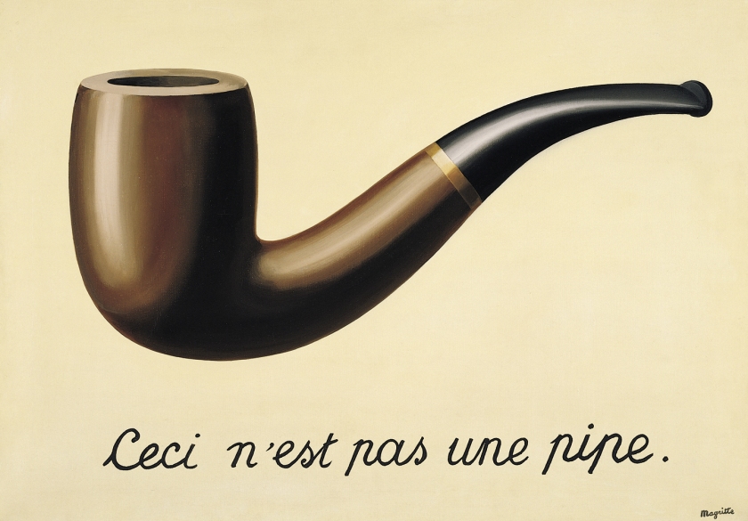
Magritte used the same approach in a painting of an apple, inserting a caption with the image of the fruit. In these “Ceci n’est pas” works, Magritte points out that no matter how naturalistically or realistically we depict an object, we never do catch the item itself.

Among Magritte’s works are a number of surrealist versions of other famous paintings such as his The Human Condition series(1933, 1935) or The Promenades of Euclid (1995).

300px-The_Human_Condition_1935  Art - Magritte - Les Promenades d'Euclide

Magritte’s use of ordinary objects in unfamiliar spaces is joined to his desire to create poetic imagery. He described the act of painting as “the art of putting colors side by side in such a way that their real aspect is effaced, so that familiar objects become united in a single poetically disciplined image. The poetry of this image dispenses with any symbolic significance, old or new.”

René Magritte described his paintings as “visible images which conceal nothing; they evoke mystery and, indeed, when one sees one of my pictures, one asks oneself this simple question, ‘What does that mean?’. It does not mean anything, because mystery means nothing either, it is unknowable.”

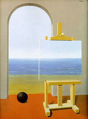
We will now look into one of his most famous paintings, “Les Valeurs Personnelles” (1952):
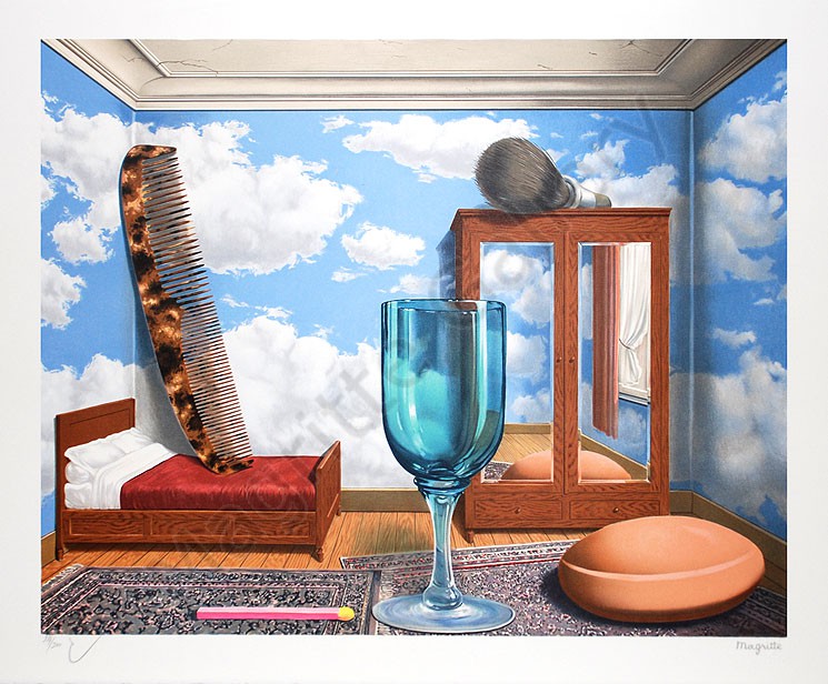
valeurs

Description

In this painting, there are several commonly seen items, namely a comb, matchstick, shaving brush, bar of soap, and wineglass that are blown up to human-sized proportions. The items are arranged randomly and without any order. Their magnified scale gives the viewers a sense of presence and that the room is completely occupied, also at the time, threatening the viewer’s comfortable familiarity of these common objects, suggesting that there is no room for the viewers. The background, or rather the wallpaper of the room is of fluffy whit clouds against an azure blue sky which feels seemingly calm and dream-like. From the mirror’s reflection, a white curtain can be seen.

Analysis

A variation of colours is being used in the painting and the colours are almost identical to the real-life objects themselves, making the objects look incredibly realistic. There is also balance achieved between the warm and the cool colours, most of the warm colours used are brown while the cool colours are mostly made up of blue, hence, adding a touch of vibrance to the painting.

The brushstrokes that Magritte employed is extremely fine, almost invisible and extremely well-blended, allowing the painting to look realistic and in its most natural state, while making the painting polished and refined at the same time. With the goal of letting viewers relate to the painting, Magritte managed to portray the objects naturalistically so that viewers can relate to the objects that they see in the painting.

The detailed shadows and tones that are given to the objects makes the realistically painted objects look well-modelled and three-dimensional . The lines and higlights also gives the objects the curvatures and edges that they should have, also at the same time, creating the different textures of the objects, for example, the highlights and the fine lines that are being used to paint the glass makes it look extremely realistic even in terms of the reflection of light on the glass, the viewers can even see the depth of the glass through the painting.

The direction of light seems to come from the right side of the painting, where the window is located, as the shadows of the objects fall on the left side of the painting. The addition of light and tones also allows the painting to become more lively and vibrant.

The composition of the painting seems to be rather symmetrical, with the glass being at the centre of the painting and three objects on each side of the paintings, scattered randomly.

The overall mood of the painting is rather calming and serene due to the balanced use of cool and warm colours that adds a touch of exuberance and joy to the painting, also the clouds create an illusion of calmness, however, as much as the painting gives off a sense of calmness, it also gives off a sense of confusion and puzzlement, with the unusal proportion of the commonly seen objects and the size of the room in comparison to these onjects. The scale of the different objects scream surrealism but the details of the paitning makes the onjects look naturalistic and raw ; hence, prompting viwers to rethink the objects that used to be familiar to them.

Interpretation

Personally, I feel that all these objects that are depicted in this painting belong to Magritte himself as they would have been readily at hand in Magritte’s Brussels flat, which doubled as his studio. Also, he once wrote “Painting for me is a description of a thought. The thought can only consist of visible objects, which exist in my head as clear images. A comb for example, I make a lot of drawings of it. That in turn will suggest other images — a wineglass, a shaving brush” Hence, it is indeed possible to say that these objects are his personal objects, moreover, by using his own personal belongings, it is easier for him to tell a stroy using these objects, at the same time, also bringing in his own personal emotios and values that he relates the object to. I feel that Magritte had included these commonly seen items around the house to connect with the viewers, causing them to thik about their own personal values and what holds meaning for them, but more importantly, to get them to think of what is significant in their lives. Although the objects depicted in the painting, even the bedroom, might seem familiar,  however contrary to the intimacy we commonly attribute to a person’s sleeping quarters, this room seems strangely, sterile devoid of the human touch, emmiting a sense of isolation and a world in which we humans do not belong in.  Instead of human inhabitants, enormously scaled personal items stand eerily at attention.  By placing these objects together, Magritte causes us to rethink our own relationship to ordinary personal items, to question our thoughtless and routine interactions with familiar objects, and to stop and assess the values they represent.
Bed and Matchstick

The tightly made bed reflects the same formal rigour as the rest of the painting.  But its proximity to the matchstick (in French an “allumette”) suggests a play on the French phrase “Tu m’allumes,” or “You turn me on.”  This visual pun conveys both Magritte’s sense of humour and his appreciation of the surrealist’s appreciation of the erotic.

Comb

Like the soap and shaving brush the comb is used to present a socially accepted exterior.  Resting on the bed like a standing figure, it’s placement draws attention to the affinity between the pillow upon which one rests one’s head, and the comb, which is used to groom one’s hair after resting, prior to returning to the company of polite society.

Sky

The floorboards and ceiling imply that the scene takes place within a room.  Yet the sky painted on the walls and reflected in the armoire mirror challenge this assumption.  Playing with notions of mental and atmospheric space, Magritte suggests that the breadth of this room is as unbounded by its physical limits as is human imagination.

Wardrobe

As with the surrealists, Magritte used the iconography of the mirror to represent psychological space and the realm of fantasy, as possibly enhanced by the sky reflected in the armoire mirror.  The armoire itself suggests a psychological interior, perhaps holding clues to the life of the room’s inhabitant.

Soap

The soap and shaving brush suggest the importance of grooming to the inhabitant of the room.  Yet the careless placement of the shaving brush atop the armoire alludes to the ever-present a malady of the middle class the desire to live freely in one’s mental interior under the constant pressure to present a socially acceptable exterior.

Wine Glass

The wine glass is the single item in this composition that does not traditionally belong in the bedroom.  It is also the only object in the room to assume a fully upright stance, perhaps serving as a stand in for the room’s inhabitant or a guest.  The curvaceous glass might even imply a feminine presence, given its positioning beside the suggestive matchstick.
Judgement

I feel that this painting is indeed successful in making viewers rethink their own relationships with the their personal items and to think more about what the items represent and how it is significant to them. I think that the message that Magritte wants the convey to the viwers come as a strong and impactful one as these objects are usually what people would take for granted and not give a spare thought about using them and the impact comes visually as an effect of the unusally scaled items, making them realise that these objects might be more than what they mean. By analysing this painting, I feel that viewers would indeed start to value and think about their personal items more and relate a personal value to the object, making them treasure their objects more. I think that the message that Magritte wants to bring across to the readers can also be applied to daily life and everyone;s life essentially as they should always treasure the things and people around them and not take them for granted.

Overall, I really like this painting and the message that the artist tries to bring across to the viewers.

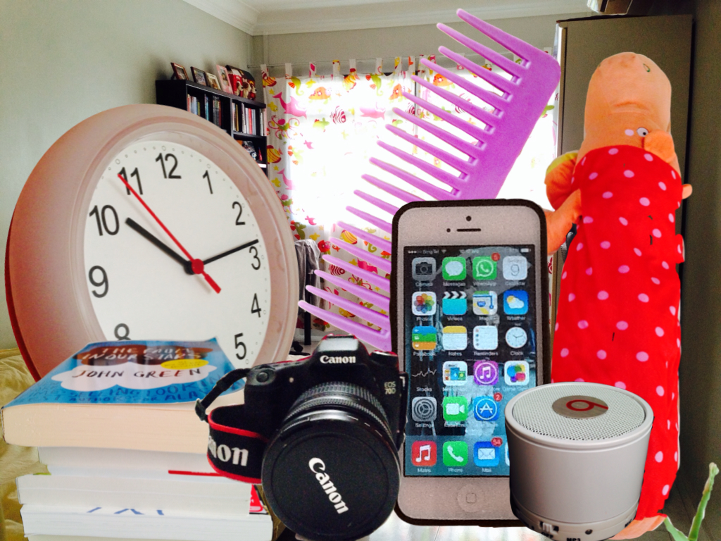
Response: My Personal Values Room

collage

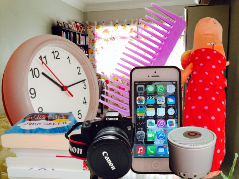
In response to Magritte’s work, I have made my own collage of seven items that holds personal value to me.

Clock

I believe that time means a lot to everybody, including me. I feel that time is always around me and taking part in every single part of my life, also it is the one that stresses me out the most. As time is passing by without stopping, I feel that it is best to use time wisely and to live happily because there is no turning back for time.

Books

I feel that books are my passports to the different parts of the world, and to even to worlds that do not exist. Without spending a lot of money, I can get to know more about the world, know more about others’ stories and to gain more knowledge about the world. By reading books, I feel relax and being able to think more clearly and learn how to live life more wisely.

Camera

My camera to me is like my second pair of eyes, recording and capturing the world that I see and that I normally don’t, and storing them for later use. I feel that my camera is a unique pair of eyes because when I use my camera, I notice thing that I’ll never notice usually and it also allows me to record moments that I never want to forget and people and things, or even places that tell a different story.

Comb

The comb is a personal grooming item and to me, it means personal image. With society being so judgemental these days, I feel that there is indeed a need to give others a good impression of myself, hence, i think that the comb is very important to me in terms of being able to remain in my best shape and confidence needed to face the world.

Phone

My phone is my ticket to connection with the world. With the phone being a convenient device for communication, I feel that it represents a part of me in communication with the society, be it friends or family. Without wasting much time, I could contact the person that I want within seconds. Although I treasure my phone a lot as it opens the door to a bigger world (internet), I feel that traditional communication would work better for a person like me.

Speaker

The speaker to me is a zone where I can be isolated from the world and be free of all thoughts. I think of it as a personal space, a sanctuary, where only I exist, where time doesn’t pass and everything in the world stops in movement. When I use the speakers, I feel like I’m carefree, drifting in a space that is mine and that is the only place where I can truely relax and rest.

Stuffed Hippo Bolster

I feel that it is companion that I can talk to whenever I have worries and discontentment, a companion without comments and won;t speak back, but just continue to listen. To me, it is like a friend that would not betray and would always be there for me.

The objects are arranged randomly as I feel that the uses of these objects vary from time to time and from situation to situation but the clock, in terms of scale, is the biggest as it makes up my life and is always around me, even when now, while I’m typing this text. Although the items are arranged randomly, just like Magritte’s painting, there is also a line of symmetry in the collage. The comb is the centre of the collage, with three items ofeach side of the collage, hence, turning out to be balanced. The items are in close proximity to each other, meaning that they are always interconnected to my life in some very close way and that my life would never be the same without any of these items.


Nanyang Style

What is the Nanyang Style? 
The Nanyang Style refers to the use of a mix of styles and techniques from Chinese pictorial traditions and the School of Paris, which was practised by a group of artists who featured prominently within the local cultural scene in the years after the end of the Second World War.

  • Nanyang artists painted outdoors to capture everyday existences.
  • Colours were quite subjectively used, and symbols were adopted.
  • In addition, the artists’ brushworks were executed with the skill of traditional Chinese painting.
  • The artists were also striving to represent the region’s culture and lifestyle– the word “南洋”(nanyang) means “Southern Seas” in Chinese, and referred to the entire South China Sea region.

The Pioneer Nanyang Artists

Cheong Soo Pieng, Chen Chong Swee, Chen Wen Hsi, Liu Kang and Georgette Chen.
Four stand out from these, for their growth as artists was spurred tremendously by their trip to Bali in 1952.
These painters are Cheong Soo Pieng, Chen Chong Swee, Chen Wen Hsi and Liu Kang.
The artists were struck by the exoticism of Bali, and having gained inspiration from the bright colours, sights and sounds of Bali.
All four were graduates of Shanghai’s Xin Hua Academy of Fine Arts, all taught at NAFA at some point, and all had exposure to the varied French schools of art– whether through self-exploration by living in European cities for periods at a time, or via art journals and communication with European artists based in Southeast Asia.

My work focused on using Chen Chong Swee’s Scenery as an example and by analysing it, helps to introduce viewers to the different characteristics of the Nanyang Style.

Chen Chong Swee was the first person to attempt a synthesis of distinctive aesthetic traditions of the East and the West, which later became known as “Nanyang School” Chinese painting style. He, being extremely outstanding in the field of watercolours, was one of the founding members of Singapore’s Watercolour Society. He and the four other pioneer artists (Liu Kang, Chen Wen Hsi and Cheong Soo Pieng took a lot of trips to Bali and Malaysia in search of inspiration and what was authentically Southeast Asian. The trips hence provided the artists with a lot of material for the visual expression that is uniquely Southeast Asian and also revealing Southeast Asian art to be ritualistic, experimental and decorative. Not only was he keen on developing the Nanyang Style, he was also interested in letting more people learn about the style and the goals behind the style. He was a large contributor to written reviews and reflections of works and trends in art. He also wrote an issue where he discussed the fundamental differences between Eastern and Western art, the need to combine both to produce a completely new style and the need to develop traditional Chinese painting as to be relevant to the multicultural environment of that time. He was also the first artist to incorporate the local subject matter of Singapore into Chinese ink painting.

Chen Chong Swee believes that there are 6 principles, all of which must be sustained, in the ink painting tradition:

  1. Spirit Resonance and Life Movement
  2. Bone Manner (structure): use of the brush
  3. Conform with the Objects to give likeness
  4. Apply the colors according to the characteristics
  5. Plan and design (composition)
  6. To transmit models by drawing

He believed that a student of ink painting needed to fully comprehend all the six principles in order to create a good ink work.
Chen Chong Swee believed that “Art is a part of life and cannot exist independently from real life.  If it fails to be accepted by another (as it is subjective), it looses its essence of universality and can no longer exist as art”.

In his work, Scenery, a combination of elements from the Western art and the Eastern art. His arrangement and portrayal of the subject matter is very similar to the Chinese ink paintings and also his brushstrokes were executed with the skill of traditional Chinese painting, seemingly realistic but painterly. This was one of the most important characteristics of Nanyang Style.

The colours used in this painting are also very bright and rich. It captures the colours of the scenery really well and maintains the original feel of the scenery even in his painting. The colours in the foreground are very rich and as it goes further into the background, the colours slowly fade, similar in technique to the Chinese ink paintings. With the influence of the Western art, the colours used are more vibrant and eye-catching, rather than dull and mundane or even monochrome. Hence, the vibrant colours used by the artists are also a notable characteristic in the Nanyang Style.

The background of the painting is of the mountains shrouded by clouds and this kind of background is normally found in Chinese ink painting , which retains qualities of the vast and infinite space for the viewers to imagine . This, in fact, is also one of the characteristics infused into the Nanyang Styleand is normally evident in paintings of other sceneries.

The subject matter is outdoors. This trait possessed by the Nanyang Style artists helps them to observe the environment that they live in better. They like to paint outdoors so that they can fully feel the air around the subject matter and energy that it carries and translate all of this into a painting, hence, essentially capturing the essence of the scenery.

Other characteristics of Nanyang Style:

  • White/Black/Dark outlines are often used (influenced by the Batik paintings)
  • Subject matter normally based on Bali (sceneries and people etc)
  • Normally tells audiences of the society’s culture

photo 3

photo 2photo 1

Written Review:

I feel that my work is quite successful in capturing the spirit of Nanyang because I’ve incorporated the backbone of the Nanyang Style, which is the combination of the Western art and the Eastern art. My artwork starts from the right, resembling a Chinese scroll and the chinese words, which is the introduction to Nanyang Style and Chen Chong Swee, are written from down to up, left to right, which is the traditional style of chinese writing in the past. For my artwork, I’ve decided to use Chen Chong Swee’s Scenery to depict the characteristics of Nanyang Style as I feel that the viewers would be able to relate the style to a specific artwork more and realise how the characteristics appear in an actaul Nnanyang Style artwork. Hence, by analysing Scenery, I brought out the characteristics of the Nanyang Style. On the left side, I introduced Nanyang Style in English, along with the pioneers of Nanyang Style, also, introducing some of the notable works by these pioneer artists. I feel that my artwork is  able to capture the spirit of the Nanyang Style by using the simple layouts and introductions to the most imporatant parts of Nanyang Style.


2014 Life Skills Camp (Graces) Logo Tshirt

Graces Tee Design 2014

For the last year, I decided to design something of a different style from the previous years. While drawing up my mindmap, I thought of elements of grace and how colours can also bring out beauty and gracefulness with the softness of the pastels. I thought of elements like ribbons, heels, brushes and a fawn but the one that I’m most pleased with would be the make-up brushes and the softness of the brush itself and the colours from the powder seem to represent a change towards a part of life that would be richer in colour and presents more possibilities.

photo 1

Mindmap

Next I worked on my thoughts and how I would want the style of the product to come about. I got my inspirations from a graphic design books that talkes about various famous graphic design pioneers and I was really inspired and influenced by some of their style and how it all linked to marketing and advertising. And since, the tshirt logo is something that I want the viewers to be able to remember at a short glance, I need the logo to be really attention seeking and the words must be visually paired with the graphics(drawings). Hence, i wrote out a page to organise my thoughts nad objectives for the design.

gphoto 2

Organisation of thoughts and Objectives

As I mentioned earlier, my inspirations came from the graphic designer pioneers, people like Lucian Bernhard, Hans Rudi Erdt, Ludwig Hohlwein, Filippo Tommaso Marinett etc. Hence, for my artist references, I decided to anaylse some of their designs and see what points I can learn from them and what would be suitable for the Graces tee design. I felt that I was able to learn a lot of technical and reasonings behind the arrangements of the words and the graphins and what the design was trying to tell the viewers. The designs really had a dynamic effect on the viewers as they were direct and bold, conveying exactly what had been intended by the designer. Tonal values and textures also help a lot in the design, making it stand out more as they would look more 3-D and with the appropriate pairing of words with the graphics, one would easily associate the graphics to the word or the brand that it was marketing for. Through anaylsing the artists’ work, I also felt that I had learnt a lot about how graphic design came to be and how it changed throughout the years, and even how the Bauhaus was included in this rich history.

photo 3

Artists’ Reference 1

photo 4

Artists’ Reference 2

Firstly, I’ve decided to work on the logo that would be on the tshirt front, the smaller logo. I’ve picked make-up brushes as a main subject matter and tried out the different styles of presenting it and the orientation of the brush. I’ve also made some notations as to where I think each draft can be improved or whether it is suitable for the tshirt design or not. Then I worked on my draft designs for the front logo, onw which is inked and one which is dotted. The inked one allowed me to play with the positive and negative spaces and also the arrangements of the words. The dotted on on the other hand, is richer in tonal values and present a fresher idea unlike the over-used mathod of inking.

photo 5

Sketch

photo 6

Draft

Next, I started to work on the back design. I was deciding between using a more asian model or a more eurasian model but I’ve decided to go with the more asian one as Graces is held in Singapore and logically speaking, it would be more relatable to design using an asian model as the subject matter. I pointed out some similarities and differences between the two models and added a little of my thoughts on the right hand side. Then, i drew up two drafts which are both inked. The first one would show a more elegant and mature woman as compared to the second one, which looks more childish.

photo 7

Selecting Models

photo 8

Draft

Since, I’ve decided to use the ‘pointilism’ style for the logo, I wanted to make the logos simliar in style so that they complement each other. I thought I like the front logo design better as I thought that the different elements in the design really complemented each other well, even the drawings and the words; hence, it I thought that it really represented Graces as a whole. As fot the back design, I felt that it could be worked on more as it doesn’t really stand out yetand the style of the words are rather different from the design itself, however, I still thought that it was an improvement from breaking away from my usual inking style.

photo 11

Front Logo Design

photo 9

Back Logo Design

After this project, I felt that other than coming up with two designs that I’m quite satisfied with, I’ve also learnt another form of art, which is the graphics design and also a bit of its history, giving me more inspirations and techniques that I can venture into. I felt that it has also equipped me with another style of design and not just stick to the norm, but make my designs more unique and outstanding. However, I feel that I still have a long way to go and I would work harder towards improving my techniques and of course, the study of visual arts.

Inspired Work from ‘Herons’–Chen Wen Hsi

chen wen hsi

Herons–Chen Wen Hsi (1990), Chinese ink and colours

Theme: Space/Structure

Topics: Pictorial Space, The treatment of space and structure in 2-D artworks

Artists use different methods to represent pictorial space on the 2-D surface. These methods range from attempts to recreate an illusionist space to exploration of space and structure on the 2-D surface itself.

The subject matter of this painting is a flock of herons of many different colours, against a white background. The painting also seems to include a pond with fishes in it, which shows that the artist somehow miraculously combined two separate spaces into one in this 2-D work– the sky and the pond. The flock of herons seems to be fighting to feed on the fishes in the pond.

The theme that the artist has selected in this painting conveys to the viewers his fascination for clutter and his love to interplay light and forms in chaotic subjects. The elements are being very cleverly used in this painting. For example, the shapes are geometric and are experimented by placing them in different perspectives without any noticeable patterns. The colours are also placed at random. Hence, this use of colour and shape cause a visual fragmentation, with the lines and tonal value adding to this effect, bringing out the spacial and structural properties of this painting.

The middle of the painting is more concentrated as the artist manipulates space, making the centre look more crwoded with herons as compared to the other two sides of the painting. He achieved this by placing the herons in the centre vertically with lesser spacing between them and placing lesser herons at the two sides with a mix of both vertical and horizontal arrangement. This compacted rhythm and guidance from the herons of the two sides (using lines) enables a line of visual contact to be made with the centre of the painting.

The artist makes use the depth to bring out his theme further. Firstly, his herons are of different shapes and sizes. The smaller herons thus mean that they are further away from the herons that are bigger in size. He also uses overlapping to achieve this. Hence, these methods help to prevent the painting from looking too “flat” and also creates depth in a 2-D painting with a zero point perspective.

The warm colours of the herons make the painting feel warm and peaceful although the subject matter is of the herons fighting for fishes (or survival). The brushworks used in this painting is greatly similar to the traditional Chinesee painting style, especially the fishes in the pond. For the herons, they are painted in a more abstract style, using angular and geometric shapes, probably inspired by the Cubists, where the objects are broken up and re-assembled in an abstract form. Hence, it can be seen that the artist gave Chinese traditional painting a twist but perserved its symbolism.

The colours used in the painting are mostly made up of orange and grey. Both balances each other out to give a warm and calm feeling to the overall mood of the painting . This balance also symbolises the balance of both the East and the West in this painting as the artist created this painting using Chinese painting and Western oil paint and yet, managed to create and acheive harmony and balance throughout the whole painting, indirectly conveying to the viewers a very important message: Telling the wolrd to be more opened-minded and always be ready to accept changes and in this case, Western and Chinese painting can also be combined seamlessly to create a new form of art.

Our Group’s Response

photo 2

Inspired by this artwork, my group has decided to recreate Chen Wen Hsi’s “Heron” but with a slight twist, which is making the work 3-D. We felt that this would better represent the harmony between the many different natural elements in the painting. We made origami herons and paper with frilled ends to represent trees. We did our own interpretation of the harmony between the pond and the sky, with the herons being 3-D, it gives a stronger image of the herons flying in the sky but at the same time, fighting for the fishes in the pond, giving the viewers a wider imagination space. The pond is represented by the reflection of the water so that its brings out more depth instead of just painting the whole base blue, or using blue paper. Fishes are also drawn or pasted on the base, the pasted ones means that they are much closer to the surface than those that are being drawn and thus help to show depth of the work. By working on this artwork that is inspired by Chen Wen Hsi, we felt that we had surely learnt a lot and of course, different perspectives of viewing spacial and structural usage and also the wonders of the combination of Chinese art elements and the Western art elements, which results in a genre that has a story to speak for itself.